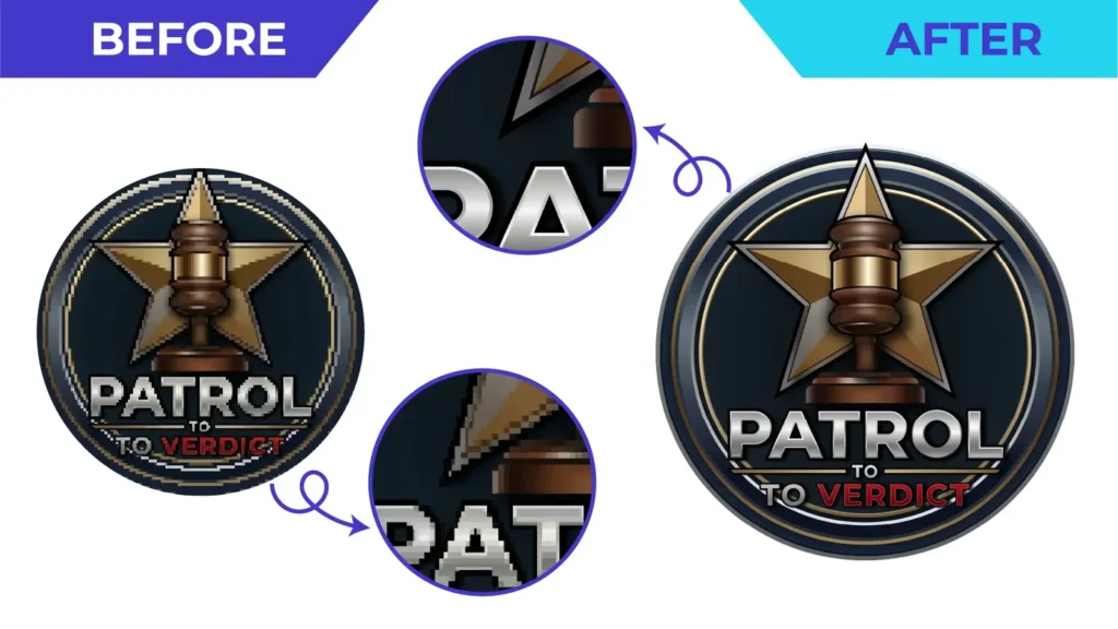
Short answer: automatic image trace converts the pixels of a raster image into vector shapes using an algorithm, while manual vector tracing rebuilds the artwork path by path, with a designer deciding where every curve, corner and anchor point belongs. Auto trace is fast and can be good enough for simple, clean sources. Manual tracing takes longer, but produces cleaner geometry that is easier to edit and more dependable in production.
How automatic image trace works
Tools such as Illustrator’s Image Trace look at the colour and contrast of each pixel and draw vector outlines around areas that look similar. You choose settings such as the number of colours, path fidelity and corner sensitivity, and the software does the rest in seconds.
The important point is that the software does not know what the design is meant to be. It only sees pixels. If the source is a small, compressed JPG, the trace faithfully follows the blur, the jagged stair-steps and the compression noise, because to the algorithm those are part of the picture.
How manual vector tracing works
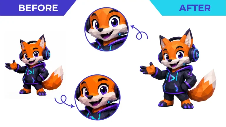
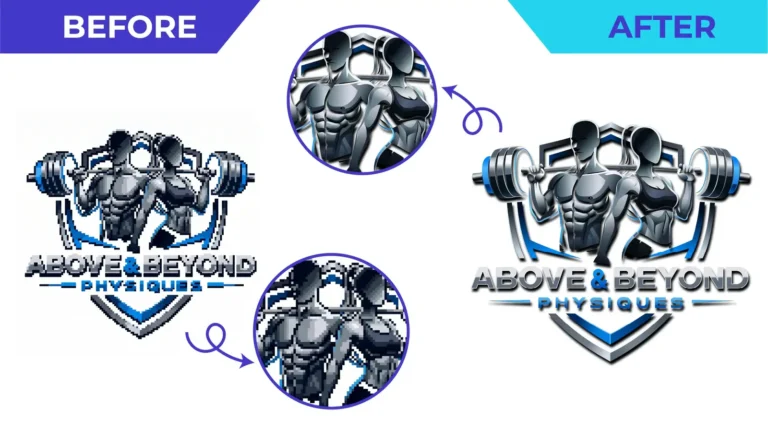
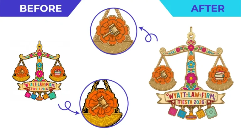
In a manual redraw, a designer uses the original as a reference and constructs new vector paths with the pen and shape tools. The aim is to reproduce the design, not the damage:
- Straight edges are drawn as straight lines and curves as smooth Bézier curves.
- Circles, symmetry and alignment are restored where the design clearly intended them.
- Lettering is rebuilt or matched carefully instead of being traced as blobs.
- Each colour area becomes a clean, closed shape with a sensible number of anchor points.
Where the source is too unclear to read a detail, a good vector artist asks rather than guessing. You can read more about our approach on the manual vector tracing service page.
The typical quality differences
| Typical auto trace | Manual vector tracing |
|---|---|
| Many unnecessary anchor points | Controlled, deliberate anchor points |
| Wobbly curves and rounded corners | Smooth curves and crisp corners |
| Blur and noise turned into shapes | Detail rebuilt from the design intent |
| Lettering distorted or merged | Lettering redrawn or matched |
| Hard to edit or recolour | Organised, editable artwork |
These differences matter most when the file goes to production. A vinyl cutter follows every node of a path, so a wobbly auto-traced edge becomes a wobbly cut. Large signs make small imperfections very visible. A screen printer needs clean, separate colour areas. An embroidery digitizer works faster from clear shapes.
When auto trace can be enough
Automatic tracing is not always wrong. It can be a reasonable choice when:
- The source is already large, sharp and high-contrast, such as a clean black-and-white scan.
- The design is simple, with few colours and no small lettering.
- The result is for informal or short-term use and nobody needs to edit it later.
- A deliberately rough, textured or hand-made look is wanted.
Even then, it is worth zooming in and checking the paths before sending the file to a printer.
When manual tracing is the better choice
Choose a manual redraw when:
- The only version of your logo is a small, blurry or heavily compressed image.
- The artwork includes lettering, fine lines or detailed illustration.
- The file is going to production: printing, signage, vinyl cutting, engraving or apparel.
- You need a long-term master file that your team and suppliers can edit.
For logos specifically, see our logo redraw and recreation service. For general images, scans and screenshots, see raster to vector conversion.
How to check a vector file yourself
You do not need to be a designer to spot a weak trace:
- Open the file and switch to outline view (in Illustrator, View → Outline). Thousands of tiny segments or jagged outlines are a warning sign.
- Zoom in to 400–800% on curves and corners. They should look smooth and intentional.
- Select a shape. A clean shape has a modest number of anchor points, not dozens along a simple curve.
- Check the lettering against the original. Letters should be consistent in weight and spacing.
Choosing the right workflow
If you are unsure which method your artwork needs, the deciding questions are: how clear is the source, how complex is the design, and where will the file be used? Upload what you have and tell us the intended use. We will review the file and recommend the appropriate approach before quoting.
Upload your artwork for a free quote or see real before-and-after examples.
Need This Done Properly?
Upload your artwork, tell us how it will be used, and get a free, no-obligation quote.